Web Usability Blooper: Usability Training Company website

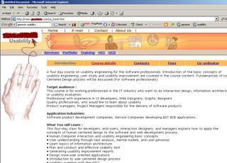
I came across this website recently, this company conducts Usability Training courses for IT professionals in my own city - Pune, India. Surprisingly the website itself lacks in basic web usability. There is no title to this page, which is very important for users as well as the search engines. If this page had a good title, it would rank higher for the relevant keywords in all search engines, the current title "Untitled Document" makes no sense. Beside this, there is no Bread/Crumb navigation implementation on the site, Logo has no link(you can't click the logo to go to Home Page), and no Site Map.
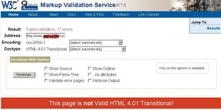
On the top of all, when you try to validate the site for basic HTML

validations, W3C's HTML Validation service gives this result: Failed validation, 17 errors.
Just wondering what could be the quality of their Usability Training courses ;)
Well I will still visit them and find out what they have to offer as a part of their training course in HCI and Usability Engineering.


0 Comments:
Post a Comment
<< Home