Usability errors in web forms
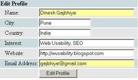
You must have seen such forms on many websites. 
If you look at this form closely you will find the usability
problem in it, the submit button name: "Edit Profile" and I am pretty sure you know what it should have been. No points for guessing "Update Profile" :)
If the Edit functionality provides the user to update details then obviously its name should be "Update Profile".
I have seen such form on a website with PR=9, no wonder the website is very popular. If such website with millions of registered users, can make usability mistakes then just imagine how many websites on www may have such usability errors.


0 Comments:
Post a Comment
<< Home