

Web Usability Blooper - Top Airline company website
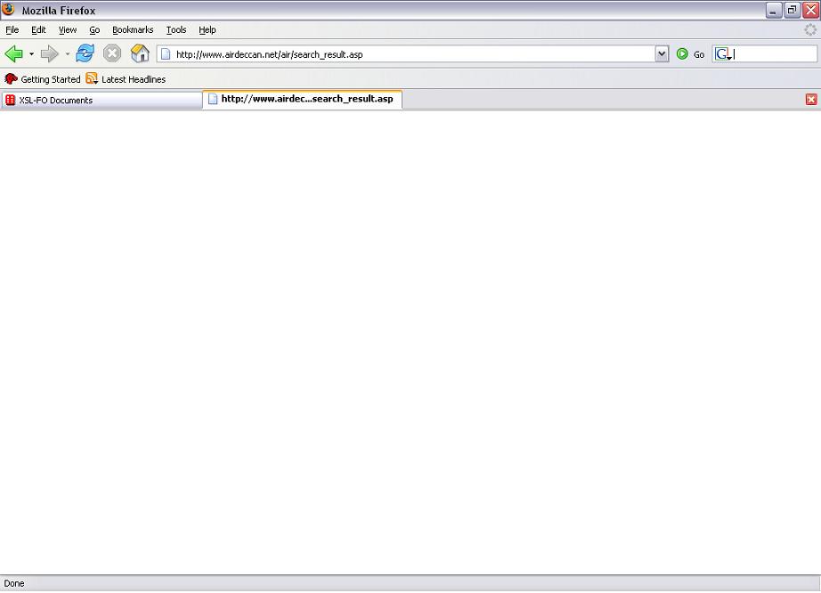
"One-way" trip is default selected so I went further and selected "Leaving From" city-A and "Departing To" city-B (auto refreshed with list of cities where service is available from city A), Departure Date, Number of Passengers by default is 1 which is what I wanted. As my selection and form filling was finished I clicked "Search" button and to my surprise the next step halted on blank page as shown below (I was using Firefox):
*Note - Click on images to see enlarged view.
 Just to make sure this is not a problem on my end (e.g. Internet Connection), I tried 3-4 times and every time it didn't show anything on this search result page. The reservation was important to me and this particular airline provides tickets at very low cost, so I decided to give it a try in Internet Explorer, because to this point I could think of only one thing and that was: the site is not compatible with Firefox.
Now it was the IE turn, I have Internet Explorer Version 6.0. Obviously I had to follow the same process for booking, so after finishing everything when I hit "Search" button, what appeared after some time was this page:
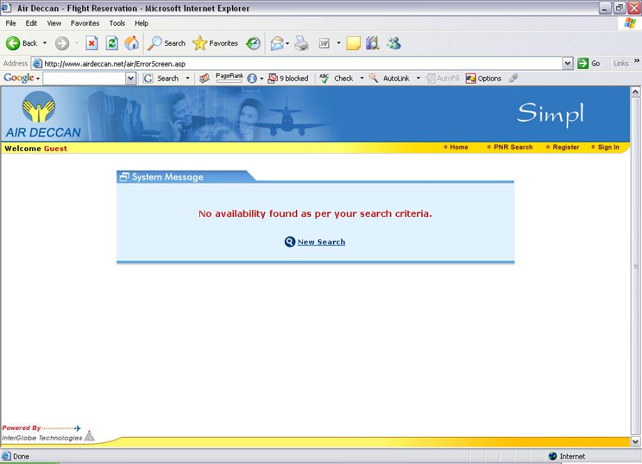 After reading the message on the screen, the first thing came to my mind was that there is no seat availabe in the flight on the date I was looking for. Can you think of anything else?
Then I thought there might be large load on their server at that time, so I searched again after some time, but same result. Then I tried on some different dates in August, but to my surprise, it showed same result.
I was already getting frustrated; I gave couple of more tries to it but same thing and finally decided to call their Customer Care. Thank god I called them up, because then only I came to know that they have actually stopped the service on A to B route. It was a big surprise to me as well as more frustration as I had already spent 3 hours on their website. Well there was no other option but to go for alternate travel arrangements.
As a Usability professional what came to my mind was that this company didn't actually thought of their online customers (common man as they promote it) interacting with their website.
The simplest thing they could have done is removing city-B from the “Departing To” list for City-A in “Leaving From”list on the search page itself and vice versa.
In case the flight is stopped for temporary period then the correct message on the next page or on the first page itself would have been something like: "Service is unavailable between city-A and city-B till
Always watch out for your messages, say it clearly and honestly, never frustrate the consumer, after all you don't wish to loose one.
My Search details: City-A: Chennai (India), City-B: Pune (India), Booking date: Any date in Aug 2006.
My personal opinion about AirDeccan: I really like and appreciate this company as it is the only company in India which made it affordable for me to travel by plane :) and for thousands of other people in India who never thought they could ever fly in their entire life.
And as it is great service provider in offline world, I wish they do the same job online too.
Website URL: http://www.airdeccan.net
posted by DG | 3:28 AM
![]()
1 Comments:
Interesting case. I find that the airlines I have used all seem like they have given serious thought to the usability, but most have small holes that are critical.
Like your blog!
Post a Comment
<< Home